Spreadsheets and Charts
The data in a spreadsheet can be used to generate graphs.
Google sheets can construct different types of graphs.
A line graph can be used to show how a value changes over time.
Time is used as the horizontal axis and the value is used as the vertical axis
Google sheets can construct different types of graphs.
A line graph can be used to show how a value changes over time.
Time is used as the horizontal axis and the value is used as the vertical axis
SSRuleOf72 - Line Graph
Use your spreadsheet SSRuleOf72 for this exercise.
Choose one of the sheets you made to create a line graph showing the growth of the investment over the doubling time.
Label the various parts of the chart appropriately.
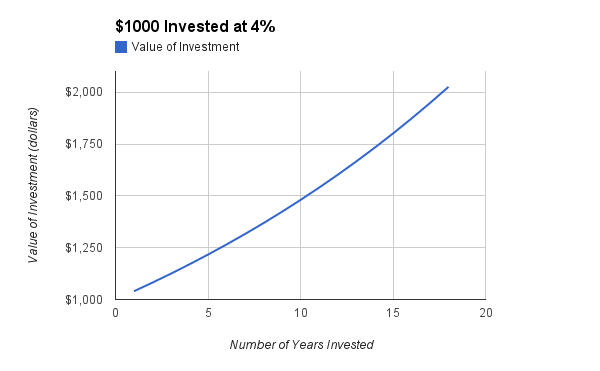
When complete, your graph should look similar to the following line graph:
Choose one of the sheets you made to create a line graph showing the growth of the investment over the doubling time.
Label the various parts of the chart appropriately.
When complete, your graph should look similar to the following line graph:
Instructions:
Try following this short video to get you started on this line graph.
Try following this short video to get you started on this line graph.
